Bivariate Korrelation (Pearson, Spearman oder Kendall)
Erforderliche Pakete laden
library(pwr)        # Power
library(mvoutlier)  # Multivariate Ausreisser
library(ggplot2)    # Grafik
library(gridExtra)  # Darstellung der Grafik
Der Beispiel-Datensatz kann hier heruntergeladen und dann mit der Funktion read.table(file=file.choose(), header=TRUE) in R geladen werden oder mittels untenstehenden Funktion direkt vom Server in R eingelesen werden.
Datensatz einlesen und Variablen spezifizieren
# Datensatz Partial.txt einlesen
data <- read.table(file="https://mmi.psycho.unibas.ch/r-toolbox/data/Partial.txt", header=TRUE)
head(data) # zeigt die ersten 6 Zeilen des Datensatzes
## CASE TIME PUBS CITS SALARY FEMALE
## 1 1 3 18 50 51876 1
## 2 2 6 3 26 54511 1
## 3 3 3 2 50 53425 1
## 4 4 8 17 34 61863 0
## 5 5 9 11 41 52926 1
## 6 6 6 6 37 47034 0# Variablen spezifizieren
X <- "CITS" # Variablennamen eingeben
Y <- "SALARY"
Korrelation <- "pearson" # Korrelationsmethode eingeben: "pearson", "spearman" oder "kendall"
CI <- .95 # Konfidenzintervall eingeben
Hypothese <- "two.sided" # zweiseitig: Hypothese="two.sided"; r>0: Hypothese="greater"; r<0: Hypothese="less"Signifikanztest
# Signifikanztest
test <- cor.test(x=data[,X], y=data[,Y], alternative=Hypothese, method=Korrelation, conf.level=CI)
if (Korrelation=="pearson") {
# Teststärke (Power)
library(pwr)
Power <- pwr.r.test(n=test$par+1, r=test$est, sig.level=.05, alternative=Hypothese)
Liste <- list(Signifikanztest=test, Power=Power)
} else {Liste <- list(Signifikanztest=test)}
Liste
## $Signifikanztest
##
## Pearson's product-moment correlation
##
## data: data[, X] and data[, Y]
## t = 5.098, df = 60, p-value = 3.69e-06
## alternative hypothesis: true correlation is not equal to 0
## 95 percent confidence interval:
## 0.3477491 0.7030024
## sample estimates:
## cor
## 0.5497664
##
##
## $Power
##
## approximate correlation power calculation (arctangh transformation)
##
## n = 61
## r = 0.5497664
## sig.level = 0.05
## power = 0.9972788
## alternative = two.sidedGrafiken
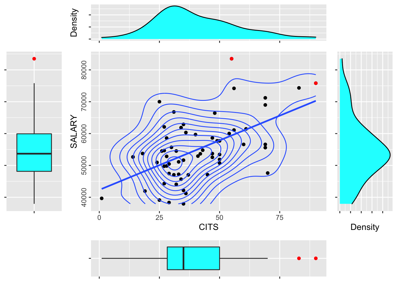
Streudiagramm, Histogrammen und Boxplots sowie markierten uni- und bivariaten Ausreissern
# Plot mit Streudiagramm, Histogrammen und Boxplots sowie markierten uni- und bivariaten Ausreissern
data2 <- na.omit(data[,c(X, Y)]); library(ggplot2)
# Bivariate Ausreisser
library(mvoutlier)
out <- aq.plot(na.omit(data[,c(X, Y)]), alpha=0.05)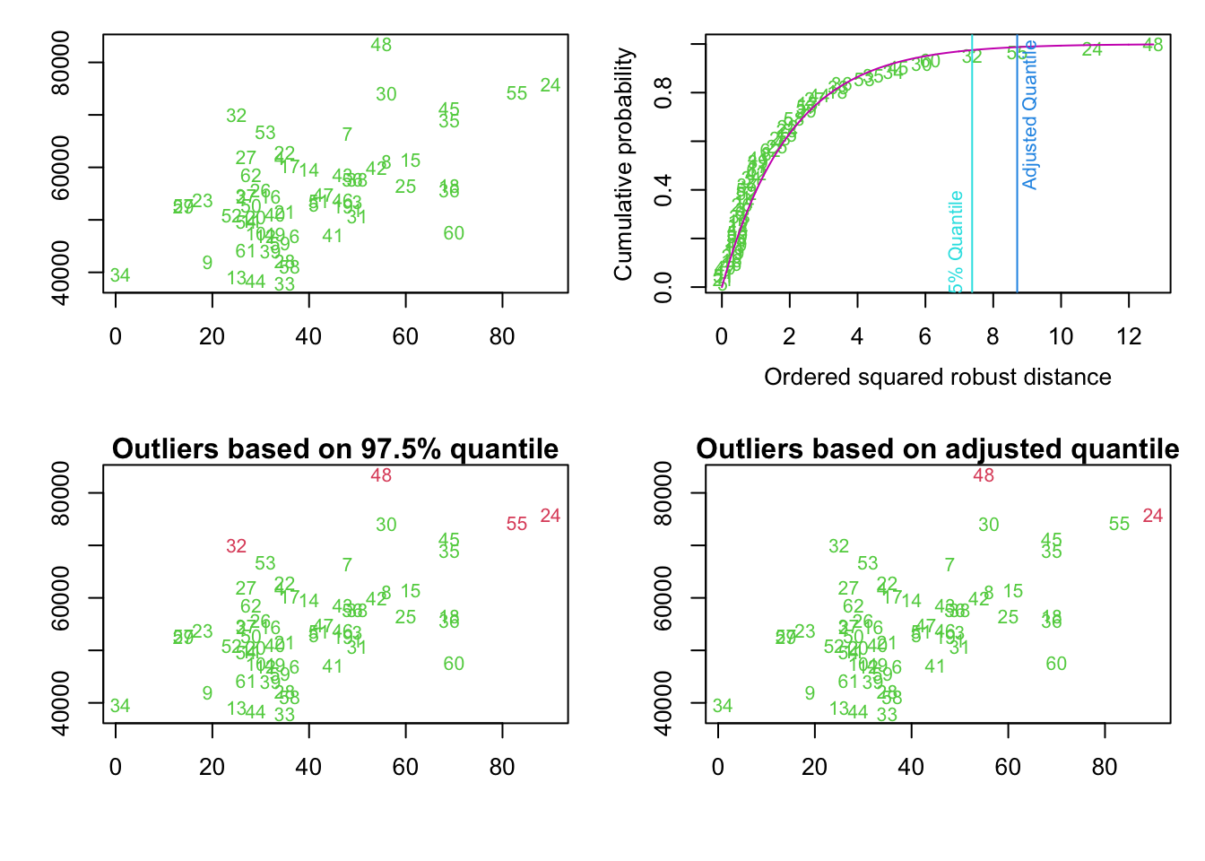
out.nr <- names(out$outliers)[out$outliers]; out.nr## [1] "24" "48"dat.outl <- data[(row.names(data) %in% out.nr),]
# Datensatz ohne obige Ausreisser
data3 <- data[(row.names(data) %in% out.nr)==FALSE,]
# Spezifikationen
library(ggplot2)
empty <- ggplot()+geom_point(aes(1,1), colour="white") + theme(plot.background = element_blank(), panel.grid.major = element_blank(), panel.grid.minor = element_blank(), panel.border = element_blank(), panel.background = element_blank(),axis.title.x = element_blank(),axis.title.y = element_blank(),axis.text.x = element_blank(), axis.text.y = element_blank(), axis.ticks = element_blank())
# Streudiagramm
scatter <- ggplot(data2,aes_string(X, Y)) + geom_point() + geom_smooth(method=lm, se=FALSE, size=1) + geom_density2d() + geom_point(data=dat.outl, aes_string(x=X, y=Y), colour="red") + theme(axis.text.y=element_text(angle=90, hjust=0.5))
# Dichtefunktionen des Paediktors (oben)
plot_top <- ggplot(data2, aes_string(X)) + geom_density(fill="cyan") + theme(axis.title.x=element_blank(), axis.text.x=element_blank(), axis.text.y=element_text(colour="white", angle=90, hjust=1))+ ylab("Density")
# Dichtefunktionen der Y (rechts)
plot_right <- ggplot(data2, aes_string(Y)) + geom_density(fill="cyan") + coord_flip() + theme(axis.text.x=element_text(colour="white"), axis.text.y=element_blank(), axis.title.y=element_blank())+ ylab("Density")
# Boxplot des Paediktors (unten)
plot_bottom <- ggplot(data2, aes_string(x="factor(1)", y=X)) + geom_boxplot(fill="cyan", coef=1.5, outlier.colour="red") + coord_flip() + theme(axis.text.x=element_blank(), axis.title.x=element_blank(), axis.text.y=element_text(colour="white", angle=90, hjust=1), axis.title.y=element_text(colour="white"))
# Boxplot der Y (links)
plot_left <- ggplot(data2, aes_string(x="factor(1)", y=Y)) + geom_boxplot(fill="cyan", coef=1.5, outlier.colour="red") + theme(axis.text.x=element_text(colour="white"), axis.title.x=element_text(colour="white"), axis.text.y=element_blank(), axis.title.y=element_blank())
library(gridExtra)
# Zusammenfuegen der Plots mit angemessenen Breiten und Hoehen fuer jede Zeile und Spalte
grid.arrange(empty, plot_top, empty, plot_left, scatter, plot_right, empty, plot_bottom, empty, ncol=3, nrow=3, widths=c(1, 4, 1), heights=c(1, 4, 1))## `geom_smooth()` using formula 'y ~ x'